Just a quick note that Paul Brazill has posted a Short Sharp Interview with me. You no doubt have it already but here is the link to his very successful blog;
http://pdbrazill.blogspot.com/2012/06/short-sharp-interview-jim-wilsky.html
What can I say about Paul that hasn't already been said and repeated a hundred times? Such talent, but truly a gentleman and nice guy on top of all that. Always so supportive of other writers.
Thanks so much Paul.
-JW
Friday, June 15, 2012
Sunday, June 3, 2012
Cover Me!
Okay, so those who know I am a Springsteen aficionado will get the reference in the title for this entry. Those who aren't or don't...come on. It was even off of Born in the USA, which I freakin' know you heard of back in the glory days of the 1980s.
But this isn't a blog about singers or songwriters. It's about hardboiled crime fiction. Right now, Jim and I are blazing through the sequel to BLOOD ON BLOOD. But most of you haven't even read the original. Have no fear. Snubnose Press will be releasing it soon -- this month, I suspect. We're looking forward to it, you can believe that. Mick and Jerzy have been on the shelf for a while and are getting antsy. Both of them (but especially Jerzy) want to punch someone in the face.
In the meantime, I thought I'd share a little bit of the inside info on the publication process, or at least one element of it. When working with a publisher, any publisher, the book's cover is a big deal. From a marketing perspective, if the book is turned sideways or you can't see the cover, it is the title that makes you grab onto it. After that, it is the cover that holds your interest. Most people will not turn the book over to look at the back jacket copy (or scroll down to read the description) if the the title and the cover do not intrigue them.
Once you get them onto the back jacket, you need crisp copy that makes the reader even more interested. Most readers will either read the first paragraph or two (so those better be good) or flip open randomly to a page and read (some people I know even have a particular page they always try...a "page 50 test"). If you can get the interested reader this far, you're in good shape, because now it is your writing that is doing the convincing, and that should be your best bet, right? If the writing's good, that is.
So if you have to hook the reader with a cover, how does a publisher decide on a particular cover? And, as another point of discussion, how much say does the writer have?
Let me answer the second question first. With a big publisher, you have almost none. With a smaller publisher, you have some. With a cool publisher, you get listened to a great deal. In all instances, the publisher has the final say, unless your contract says otherwise. Never heard of a contract that did, either.
So on to the first question. I don't have a universal answer, but here's the inside scoop on how the cover for BLOOD ON BLOOD came into being.
First, here's the description of the book:
Think Hardy Boys meets Cain and Abel.
Estranged half brothers Jerzy and Mick Sawyer are summoned to the prison where their father is dying. On his deathbed, he tells his sons about a diamond heist that he was part of and how some of those diamonds are still out there. He sets the two on a path of cooperation and competition to recover the jewels, each playing to his own strengths and against the others weaknesses.
Jerzy is the quintessential career criminal, fresh out of a short bit and looking to get back into the action right away. Mick is the failed cop and tainted hero struggling to get by with a clean life that deson't seem to ever pay off. Both men see this as their ticket out. Throw the sexy, mysterious Ania into the mis and you have all the ingredients of a classic, hard boiled story.
So...when I made a reader's copy for those who do critiques and like to read a hard copy, I threw together a quick, basic cover. Just a gun and some blood. Nothing fancy, that's for sure.
Snubnose's first version was better.
The blood and the diamonds are really great because it fits into the story elements quite well. The fact that they are facing each other is also a big piece of the conflict that is happening throughout.
The font for the title is killer. Loved it.
I also really liked the red background and the stark images that the silhouettes create.
I think this will be the final cover. Notice how much crisper the details are on the two brothers (and how the font for the authors' names is changed). The foreground is more dominant in this version, albeit subtly. And the eyes remain, creating that mysterious feminine element.
But this isn't a blog about singers or songwriters. It's about hardboiled crime fiction. Right now, Jim and I are blazing through the sequel to BLOOD ON BLOOD. But most of you haven't even read the original. Have no fear. Snubnose Press will be releasing it soon -- this month, I suspect. We're looking forward to it, you can believe that. Mick and Jerzy have been on the shelf for a while and are getting antsy. Both of them (but especially Jerzy) want to punch someone in the face.
In the meantime, I thought I'd share a little bit of the inside info on the publication process, or at least one element of it. When working with a publisher, any publisher, the book's cover is a big deal. From a marketing perspective, if the book is turned sideways or you can't see the cover, it is the title that makes you grab onto it. After that, it is the cover that holds your interest. Most people will not turn the book over to look at the back jacket copy (or scroll down to read the description) if the the title and the cover do not intrigue them.
Once you get them onto the back jacket, you need crisp copy that makes the reader even more interested. Most readers will either read the first paragraph or two (so those better be good) or flip open randomly to a page and read (some people I know even have a particular page they always try...a "page 50 test"). If you can get the interested reader this far, you're in good shape, because now it is your writing that is doing the convincing, and that should be your best bet, right? If the writing's good, that is.
So if you have to hook the reader with a cover, how does a publisher decide on a particular cover? And, as another point of discussion, how much say does the writer have?
Let me answer the second question first. With a big publisher, you have almost none. With a smaller publisher, you have some. With a cool publisher, you get listened to a great deal. In all instances, the publisher has the final say, unless your contract says otherwise. Never heard of a contract that did, either.
So on to the first question. I don't have a universal answer, but here's the inside scoop on how the cover for BLOOD ON BLOOD came into being.
First, here's the description of the book:
Think Hardy Boys meets Cain and Abel.
Estranged half brothers Jerzy and Mick Sawyer are summoned to the prison where their father is dying. On his deathbed, he tells his sons about a diamond heist that he was part of and how some of those diamonds are still out there. He sets the two on a path of cooperation and competition to recover the jewels, each playing to his own strengths and against the others weaknesses.
Jerzy is the quintessential career criminal, fresh out of a short bit and looking to get back into the action right away. Mick is the failed cop and tainted hero struggling to get by with a clean life that deson't seem to ever pay off. Both men see this as their ticket out. Throw the sexy, mysterious Ania into the mis and you have all the ingredients of a classic, hard boiled story.
 |
| Reader's Copy |
 |
| Version #1 |
The blood and the diamonds are really great because it fits into the story elements quite well. The fact that they are facing each other is also a big piece of the conflict that is happening throughout.
The font for the title is killer. Loved it.
I also really liked the red background and the stark images that the silhouettes create.
What not to like? Well, while I like the diamond/blood motif, it just ends up looking a little cheesy. And the two silhouettes are mirror images, which hints at twins, so I'm not digging that, either. But all in all, it was a good first swing of the bat. And more to the point, here is Snubnose actually asking Jim and I what we think and listening to our replies. I know. Heresy, right? But kudos to them for drawing on the authors' emotional knowledge of the story and how it might tie in where the cover is concerned.
The next several versions came all at once, which made it interesting. Instead of "what do you think of this one?", the question became, "which of these do you like best?" which is a slightly different question. I have to say, I liked having several options to discuss or choose from, and then have another discussion to fine tune the eventual choice.
 |
| Version #2 |
Version #2 is a good example of how listening to authors can mess you up.
My suggestion was the female silhouette, for starters. The idea was to introduce that subtle but important element of Ania into the cover. Since we all liked the red background, that stayed. But the silhouette of the female ends up looking like something on the back of a trucker's mudflaps, and the silhouettes of the males are largely without any urgency. They are neither lusting after the lady nor threatening or even facing each other.
The awesome font is still in evidence, though. But I didn't like the font used for the authors names very much.
As an aside, the Snubnose Press logo is pretty cool, huh?
So what happened here, I think, is that the cover artist tried to listen to the authors' suggestions, followed some, did some a little differently, and the end result was that it really didn't work that well. It's not terrible, but it doesn't grab you, either, does it?
 |
| Version #3 |
So we move on to #3. The chick is still there, which makes some sense, because I did make a big deal about having that female presence. The same font for the title, yeah. Like that. And the angled print is an interesting idea, too. Two brothers, obviously different people this time, facing each other. Good.
But seeing only one of the two faces didn't work for me. Plus, the face of the one we do see, while battered a bit, doesn't fit either Mick nor Jerzy at all. And the more I looked at this one, the more the guy started to look like a crack addict. I didn't want people to think this was a dope book, even though the subject comes up peripherally. And then I kept looking at the guy and wondered if people would think this was a vampire book. Or a book about about a crack addict who was a vampire. Then I really looked at this guy's expression and wondered if it might be love or lust he was expressing. That makes the cover seem like it might be a gay romance about a crack addicted vampire.
So no.
This is a great example of how all the elements are there, but they just don't quite mesh. The cover artist kept the woman I brayed about so much and went with live models instead of silhouettes, which works, but the framing doesn't, and the one model is wrong.
 |
| Version #4 |
Next was #4.
Lots to like here.
The concept of struggle is viscerally played out. The attire and the tatts let you know this isn't a battle of the saints, but a hard-edged fight.
The fact that they are tied up, locked in combat conveys the brother versus brother element quite well.
There's motion, which foretells action, which this book has a lot of.
And the chick is still there, so you know that the cover artist is trying hard. He's listening to the authors. They know that the female is an integral part of the story, so let's make sure she's a part of the cover. That's stick-to-it-ivness is admirable.
I don't like the title font as much as the previous ones, but it is not bad. And putting the sexy silhouette in the 'O' is a nice touch, an artist's touch.
Also, the font for the author's names are the best yet.
So what's the problem?
The only real problem is that it's just a little messy. It isn't quite as immediately clear to the reader what this book is about because you have to look at it for a while to determine what the picture beneath the title is. Once you've got it, I think it works. But you don't usually have that much time because most readers aren't that patient.
If this were the only ones that Snubnose sent, I would have voted for #4. But they sent one more.
 |
| Version #5 |
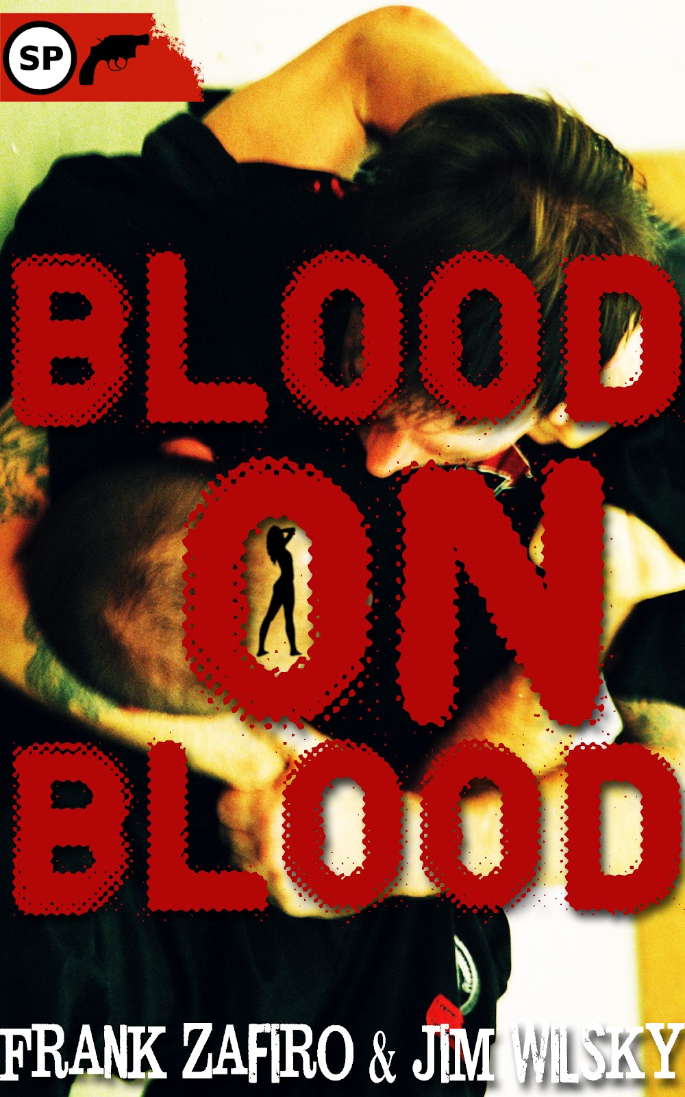
Version #5 was the hands down winner for both Jim and I. It has the two brothers, both of whom look at least a little hard. Both have guns, so you know you're getting into crime fiction and not vampire books.
For the record, the title part is a little bit our fault, as it could easily be taken for a vampire reference. But it is also about family, and the relationship between the two brothers, as well as their separate relationship with their father, is a key component to this book.
Everyone's heard about blood being thicker than water, right? Kin, family, blood. It's a common enough reference. We drew this actual phrasing from a Springsteen song about brothers ("Highway Patrolman" from Nebraska) in which two brothers find themselves on opposite sides of the law. Nevertheless, the narrator opines that "Nothing feels better than blood on blood." Mick and Jerzy are bound by the same father, but I don't think they necessarily share the same sentiment as the singer.
There is also the obvious conclusion that one can draw beyond the family reference -- that blood will be spilled. And since it is a crime fiction novel, and a gritty one at that, and full of action, I can guarantee you of that.
But back to this title. Not only do the brothers in the foreground stare into the camera while they clutch their guns, but the eyes in the background are a much better way to infuse the title with the feminine presence. And although neither of the characters really looks anything at all like I imagine Mick or Jerzy, it still conveys the idea of how different they are from each other, while still the same in other ways.
The awesome title font is back, and in red this time, which is perfect. Plus we get the additional splotching, which ramps up the expectations that this will be a bloody affair. Don't crack open this book and expect knitting needles or kittens, unless the knitting needles get plunged through someone's eyes and the kittens explode.
Ack. PETA probably just put me on their hit list. And some guy like Jerzy will likely be the one to come do the job.
The only think I really didn't dig here was the author's names in that font.
So. All of this feedback went to the publisher's cover guy. And being an artist himself, he took the input but also did his own magic. After listening to what we said and doing whatever consultations publisher's do, they decided to go with #5. The cover artist made some adjustments and this is what we ended up with:
 |
| Final Cover? |
Does this cover grab you? Does it do so right away? Do you know what kind of book you're getting into, even before you read the jacket copy?
I hope that all the answers you gave are yes, because that equals a successful cover.
Keep in mind that sharing this progression is like sharing first draft through final draft on a story or a novel. Hopefully, you start with something basic and good and progress to something more refined and sophisticated. You don't get there entirely alone, either.
I think Snubnose deserves at least a small round of applause for a few things. One, for how much they included Jim and I in this process. Two, for how much they actually listened to our feedback. Three, the cover guy, for remaining an artist in his own right. And lastly, for creating a compelling cover that will hopefully get people to flip over or scroll down and read the jacket copy.
I know this was a long post, so if you're still reading, thanks for that. We welcome any thoughts you might have on these covers, this process, or your own experiences with covers -- whether as a publisher, writer or the reader those covers are trying to impress.
Tuesday, May 22, 2012
Roll Call
We're lucky enough to have some great UK friends and writers on board with the blog - which I love. I like the idea of having some sort of global touch with other people who love the written word. We have been a little dry on comments in here lately so I'm getting out the heavy tackle and going fishing in big water, across vast lands and seas.
I have noticed with interest on our blog stats that we have regular visits from folks in Canada, France, Germany, Russia, and Australia just to name a few international locations. Now I suppose this could be one world traveler. A modern day Marco Polo, but I don't think so.
SO, I know everyone is always busy but if you have a second, just one little minute, drop us a line and say hello. We'd love to hear from you folks in other countries.
Of course that goes for anyone living here in the US of A too. Say Hey, so we know someone is out there. Throw a brick through our blog window....something....anything.
-JW
Thursday, May 17, 2012
Preview Review of BLOOD ON BLOOD!
Brian Triplett, an independent reviewer for Examiner.com, published his preview of BLOOD ON BLOOD.
You should read it.
BLOOD ON BLOOD continues to go through the publication process, with cover decisions in the works. Snubnose has been great about including us in the discussion, which is one of the many benefits of working with an independent publisher.
You should read it.
BLOOD ON BLOOD continues to go through the publication process, with cover decisions in the works. Snubnose has been great about including us in the discussion, which is one of the many benefits of working with an independent publisher.
Sunday, May 13, 2012
Rookie Mistakes - A Short Series
As the time gets shorter before BLOOD ON BLOOD comes out from the great folks at Snubnose Press, I have quickly realized that I have no clue on how this is all gonna shake out in the weeks to come.
Now Frank, my annoyingly talented, experienced and veteran writing pardner no doubt has the next 6 months mapped out with appearances up and down the west coast. Yours truly here, on the other hand, will be stumbling up to the start line, 'coming out of nowhere with tears in his eyes' and no idea of where or how in the HELL I got here. I'll be staring off into space when the starting gun goes off and once I do start running, I'll trip coming out of the blocks....and if it's the hurdles, I'll hit every one as I careen down the track.
I will need a LOT of damn help here okay?? This will be the first of a few editions of what I'm calling Rookie Mistakes:
Book Signings;
Now HEY, I'm in the selling business, been selling food nationally and internationally for as long as dirts been around. Been in little hot stuffy offices, been in gleaming posh boardrooms, been in meetings with translators and in towns you've never, EVER heard of. Dealt with some of the biggest assholes you could imagine - literally characters out of some of the stories you've written - but luckily, some of best people you could imagine too. So what the hell, what's the big deal with a book signing right? I'm not some kid, I don't spook, I'm a damn good bullshitter - refined over the years, aw schucks/thank you maam/yessir, or I can do the NY - Manhattan thing too. If I don't know, I'll sound like I know. I can sell screen doors to a submarine....So what the hell, what's the big deal with a book signing right? What am I whining about?
Well, I'll tell you the big deal. I have good instincts, that's the big deal. Like real good instincts. I can read tea leaves for cryin' out loud. And I AM spooked. Here it is,....I have this vision of 3 people all day, 2 of them think I'm an idiot and a pretender, the minute I say 'hi'....and the third one got the book mixed up with another one and thought I was somebody else. I might be wrong on this, it could 4 people all day and 3 of them think I'm a poser.
Here is what I want and need from you folks - Book signing stories, advice, successes and dismal failures. I want it all, the good, bad, do this, DON'T EVER do this. Cough it. Hep' me now.
-JW
Wednesday, May 2, 2012
Blurb Preview for BLOOD ON BLOOD!
Cindy Rosmus, the editor of "Yellow Mama" and prolific short story writer, had this to say about our forthcoming hardboiled crime novel, BLOOD ON BLOOD:
"Blood on Blood never lets up. Zafiro and Wilsky give us brotherly hate and a desire to please a cold-as-ice dad who should’ve been castrated at birth. And of course a blonde bitch to complicate things. Who gets the blonde? And the ice? Ex-cop Mick, or gangster Jerzy?"
Cindy is a hardcore cool chick, a helluva writer and her indie online mag is a hard-hitting, gritty, excellent showcase of crime fiction. Both Jim and I have been lucky enough to have had stories published there, and Jim has one coming up later this year. Cindy herself is frequently published in other venues, and her stories are edgy, sexy, dark and exciting.
You should check her out, as well as Yellow Mama.
BLOOD ON BLOOD will be published later this month by Snubnose Press.
Subscribe to:
Posts (Atom)